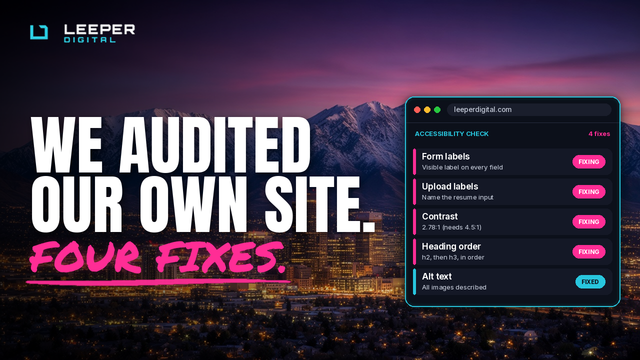
WebAIM ran its yearly accessibility check on the top million home pages, and for the first time in six years things got worse. 95.9% had detectable errors. So we pointed the same checks at leeperdigital.com, partly out of curiosity and partly because a Deaf-led agency should probably go first.
The good news first. Every page has one H1, a skip link and alt text on every image, and there's no empty button pretending to be useful. The base is solid. Four things weren't.
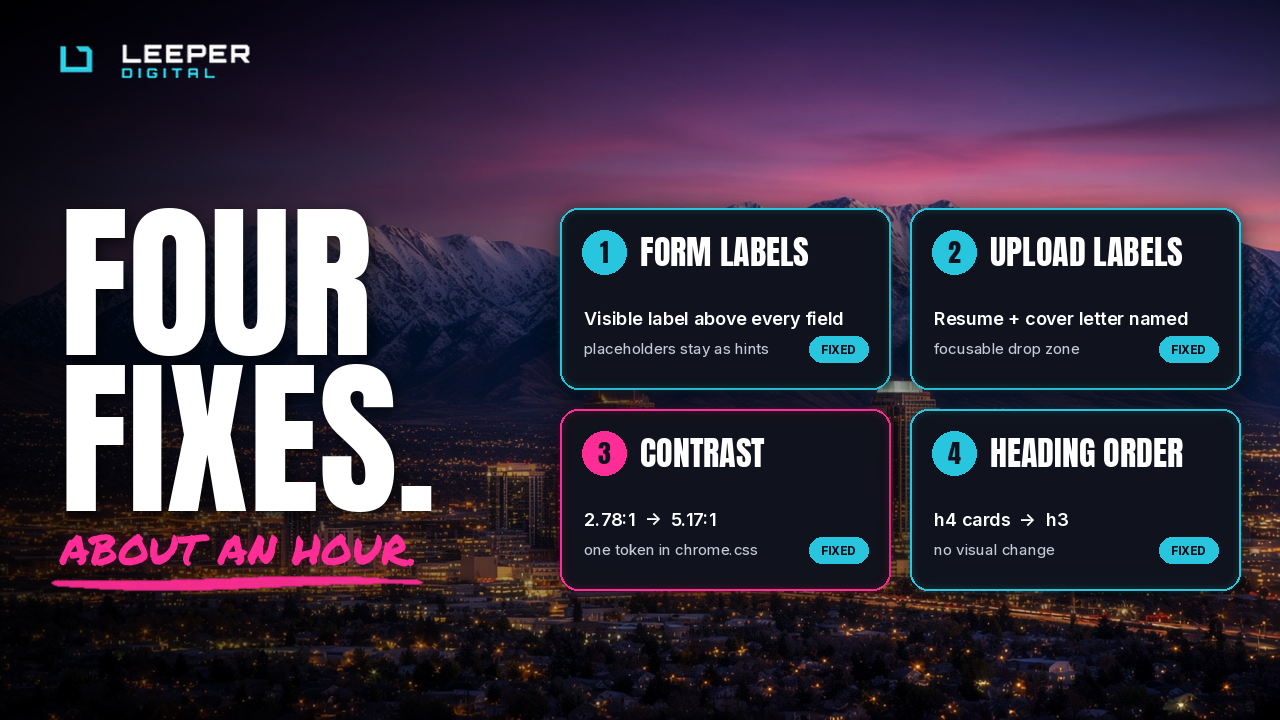
1. Our contact form used placeholders as labels.
The light grey "Name" inside the box disappears the second you start typing, which is a fun memory test nobody signed up for. Every field now gets a visible label above it.
2. Our careers upload fields had no name.
A screen reader just announced "file upload, required." Which file? Good question. Now it says Resume, and Cover letter (optional).
3. Some of our fine print was too faint.
The date on our latest post scored 2.78:1 on contrast, and the standard is 4.5:1. It looked tasteful and was hard to read. Now it's 5.17:1, and it still looks tasteful.
4. Our careers page skipped a heading level.
It went from h2 straight to h4, so anyone navigating by headings fell down a stair. It's fixed, and nothing changed visually.
All of it took about an hour. The fixes were small, and so was the excuse for skipping them.
If you want the same check on your site, the form that's now properly labeled is at leeperdigital.com/contact.