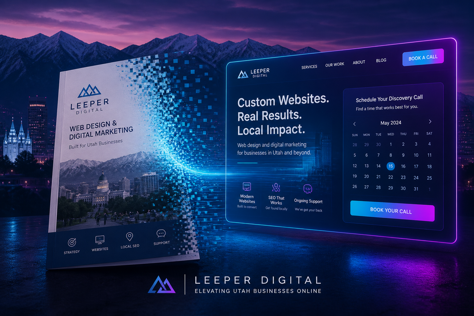
You paid a designer. You got a hero image of the Wasatch, a paragraph about “passion,” three icons, and a footer. Pretty. Quiet. Expensive.
That is a brochure. Brochures do not book HVAC calls in Sugar House or fill a Murray dental chair. They sit there while you refresh Analytics and wonder why “traffic” never turns into money.
Leeper Digital does not sell ads. We fix the thing ads would only make louder: a site that cannot close. This is the conversion-focused website playbook for Salt Lake City businesses that already have visitors and still hear crickets.
The diagnosis (you already know it)
On our homepage we call it out because we see it every week: a website that does not sell. Beautiful brochure. Zero conversions. No clear CTA. No funnel. No tracking.
Four tells, in order of how often they show up along I-15:
- The first screen is a vibe, not an offer. “Welcome to [Brand].” Nobody searched for your welcome.
- The next step is “Contact.” That is a hallway, not a door. Contact for what — a quote, a slot, a PDF, a walk-in?
- Proof is a logo row or a stock smile. No neighborhood, no constraint, no number a skeptic can check.
- You cannot name last month’s conversions. Sessions, maybe. Forms, calls, booked consults — shrug.
If you cannot answer “what should a stranger do in the next 30 seconds, and how will I know they did it?” you do not have a website. You have a PDF with a domain.
Search and Maps are other jobs. This piece is the handoff: someone already found you. Do not make them work.
What a revenue site does that a brochure refuses to do
A conversion-focused site is rude in a useful way. It picks one primary action per page and designs the whole page around it.
| Brochure | Revenue site |
|---|---|
| “We serve all of Utah” | “Same-day furnace repair in Sugar House and Millcreek. Book a window.” |
| Menu of 14 services | One hero offer + two supporting links |
| “Learn more” | “Get the 15-minute estimate” / “See openings this week” |
| Contact form with 11 fields | Name, phone or email, the job, a time window |
| Stock mountains | A photo of your truck, your suite, this quarter |
| “Trusted by locals” | One result, one constraint, one review you replied to |
You do not need a 40-page rebuild. You need the homepage and one money page to stop lying.
Page 1: the homepage is a closer, not a museum
Open yours on your phone. Cover the logo with your thumb. Can a stranger still tell what you sell, who it is for, and what happens if they tap the button?
If not, rewrite the first 80 words like this:
- Who + where. “SLC family dental on 2100 South,” not “comprehensive wellness solutions.”
- The outcome, not the adjective. “Walk out with a same-week cleaning slot,” not “compassionate care.”
- The next step in verbs they already use. Call, book, get a quote, download the checklist — one of those, not four.
Then kill the carousel. One image. One sentence. One button. Carousels are how committees hide disagreement.
Put the offer above the fold on mobile
Half your “website traffic” in this valley is a person in a parking lot or on TRAX. If the button is below a paragraph about your founding year, you already lost.
Deaf-owned and ASL-first shops: say how clients work with you on that first screen. Video consult, interpreter, in-person ASL — that is conversion copy, not a diversity badge.
Page 2: one money page that matches the search (or the DMs)
Homepage gets the brand. A service or offer page gets the sale.
Pick the thing that already pays the rent. Build one page that answers, in this order:
- What you do, in their words.
- Who it is for (and who it is not).
- What it costs or how pricing works — ranges beat “contact for pricing” for anyone who is not enterprise.
- What happens after they click (timeline, who calls whom).
- Proof from this market: a Sugar House install, a Downtown retainer, a West Valley review with a reply that sounds like a human.
Do not clone that page for every suburb you wish you served. One honest SLC or neighborhood page beats five “serving Draper to Ogden” ghosts.
This is web strategy as we mean it: audit, landing-page focus, conversion path — not a new color palette. If the money page could belong to any competitor in Utah, start with commodity service pages.
The form is where you leak money
A brochure form asks for a life story. A revenue form asks for enough to start the job.
Default: name, email or phone, one dropdown for the job type, optional note.
Kill: company size, budget, “how did you hear about us,” and anything you will not use in the first reply. You can ask that after they are in the sequence.
Speed: if you promise “we’ll reach out,” say when. Same business day before 3 p.m. Mountain is a promise. “Soon” is a shrug.
Backup CTA: phone number as a real `tel:` link. Click-to-call still closes more local jobs than a form people abandon at field four.
If you capture an email, do not collect addresses you never message. Owned list is a different article.
Proof that works in Utah (and proof that is wallpaper)
Wallpaper: “#1 in Utah,” award badges you bought, five-star widgets with no names.
Proof that converts:
- A specific result (“cut no-show rate after we added SMS confirmations”).
- A constraint (“we don’t do same-day on inversion-alert afternoons west of the Jordan”).
- A face and a first name from a review you answered like a person.
- A photo from the actual shop, not a Unsplash ridge.
Salt Lake City buyers are polite and suspicious. They have been sold. Show the work.
Tracking so you stop arguing with feelings
If you cannot see conversions, you will “optimize” the wrong headline.
Minimum stack, no ad account required:
- One primary event per money page: form submit, booked call, or click-to-call.
- A thank-you page or inline confirmation so you can fire the event once, cleanly.
- Weekly look at submits and calls, not bounce rate theater.
- UTM on links you control (email signature, GBP button, Instagram bio). Social that dumps into a brochure homepage launders attention.
Analytics without a conversion event is a weather app. Interesting. Not actionable.
A 14-day rebuild you can finish between jobs
Days 1–2 — Offer. Write one sentence: who, where, outcome, next step. Put it on the homepage hero. Delete the second button.
Days 3–5 — Money page. One service. Real area. Real FAQs from intake calls. Pricing range or “starts at.”
Days 6–7 — Form and phone. Three fields. `tel:` link. Confirmation that says who replies and when.
Days 8–10 — Proof. Three assets: one photo from this quarter, one review reply, one result or constraint in writing.
Days 11–12 — Tracking. Primary conversion event. Thank-you page. Bookmark the report you will actually open.
Days 13–14 — Friction pass. Load on phone over coffee. Time the tap path. If you hesitate, a stranger will leave.
That is Innovate-level hygiene: strategy, a site that can take a punch. Accelerate is the same work on a calendar so the brochure does not grow back.
What not to do
- Do not buy ads to “test the site.” You will test how fast you can waste money.
- Do not hire a redesign because you are bored with the hex code. Fix the offer first.
- Do not add a chatbot that restates the menu. If you need a bot to explain the CTA, the CTA is wrong.
- Do not write 2,000 words of “about.” Nobody converts on your origin story unless the origin story is the product.
Do this next
Leeper Digital is a Salt Lake City growth marketing agency. Organic-first. We do not rent you a media budget so a brochure can fail faster.
If the site looks done and the calendar is empty, start with Innovate — roadmap, essential web optimization, a real CTA. If you already have traffic and need the pages and reporting to keep tightening, take Accelerate.
Start growing — pick Innovate or Accelerate. Dominate stays reserved for Deaf-led, ASL-first work.